Introduction: Objective and Goal
Emdund Optics' Knowledge Center houses over 1,500 resources, including videos, application notes, technical tools, webinars, and more. The previous design consisted of disconnected lists, lacking organization. The goal was to create a filterable, user-friendly experience.
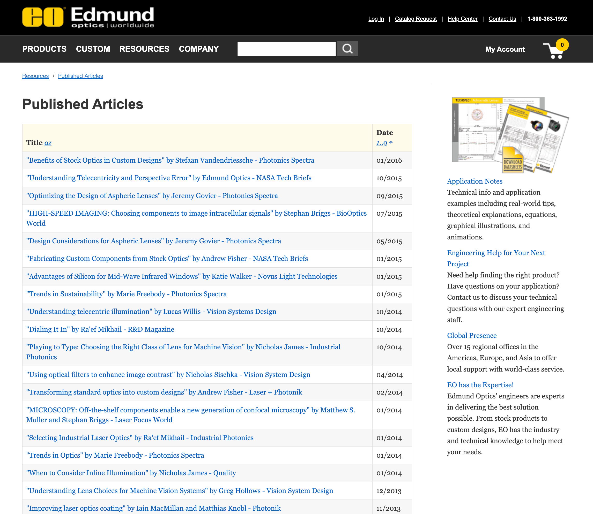
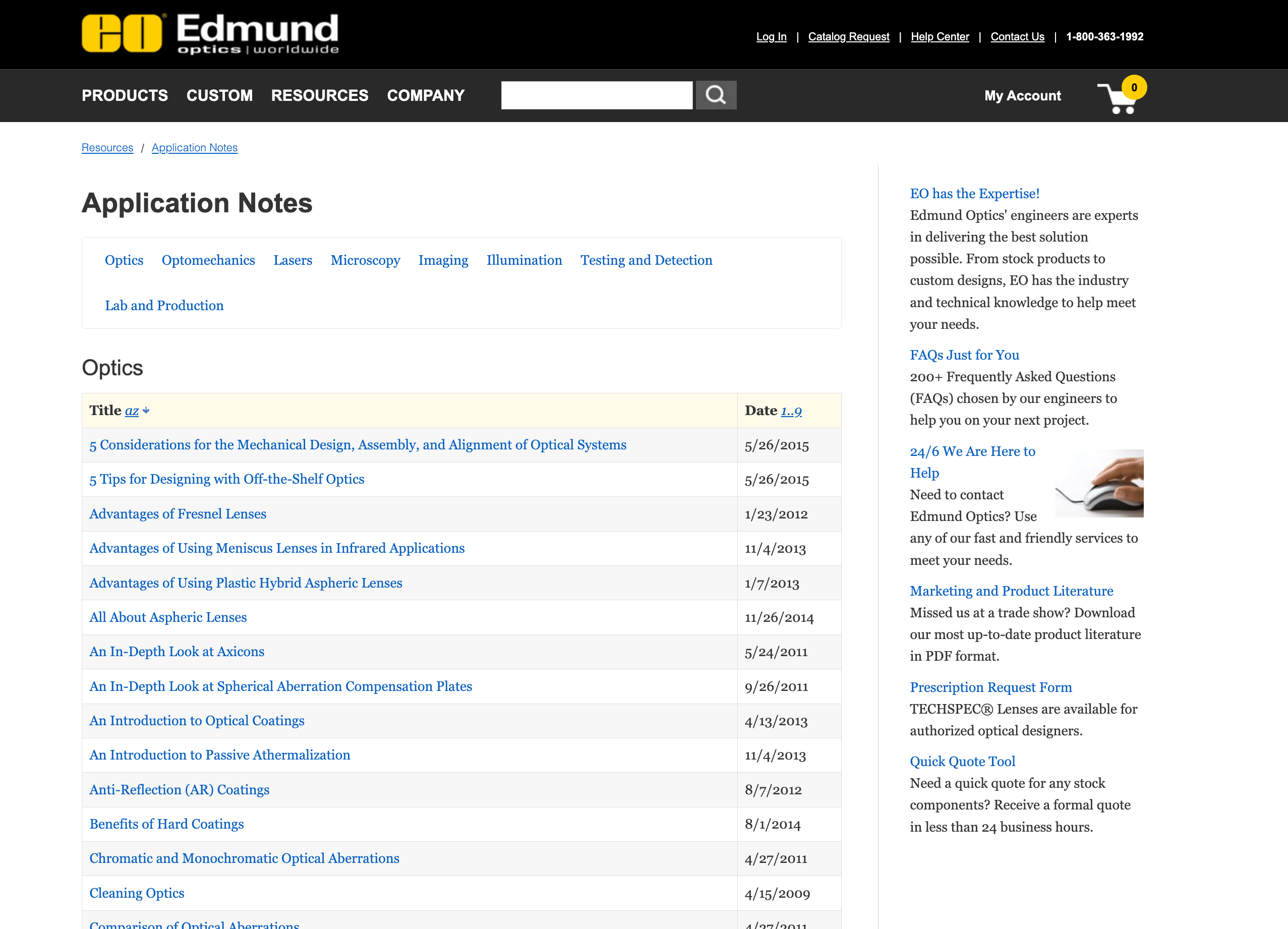
Old Resource organization: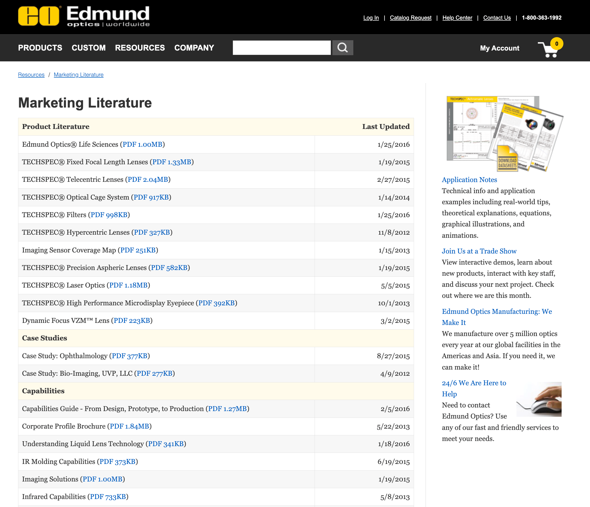
To ensure a successful project, we followed a general process:
- Requirements and Research and Content Gathering
- Branding, Wireframing, and Design System
- Content Gathering from Engineers and Sales
- Implementation and Iterations
Requirements, Research and Content Gathering
A small committee was assembled, consisting of myself (UX and design), a content engineer, and the marketing manager. We conducted a competitive analysis, reviewing companies with similar filterable resource sections to guide our approach. Additionally, we gathered feedback from customers and engineers and outlined key personas who would use the Knowledge Center. Based on this research, the following decisions were made:
- Content was organized by media type, and research showed that customers would benefit from filtering by topic.
- Secondary filtering options were added, including a search bar and media type.
- Engineers requested the ability to control topic filtering on load, so we included "Recommended" and "Recently Added" filter options.
- Optical Students
- Research and University Students
- Engineers in the optical space
- Start-ups and professionals learning how to build systems
Branding, Wireframing, and Design System
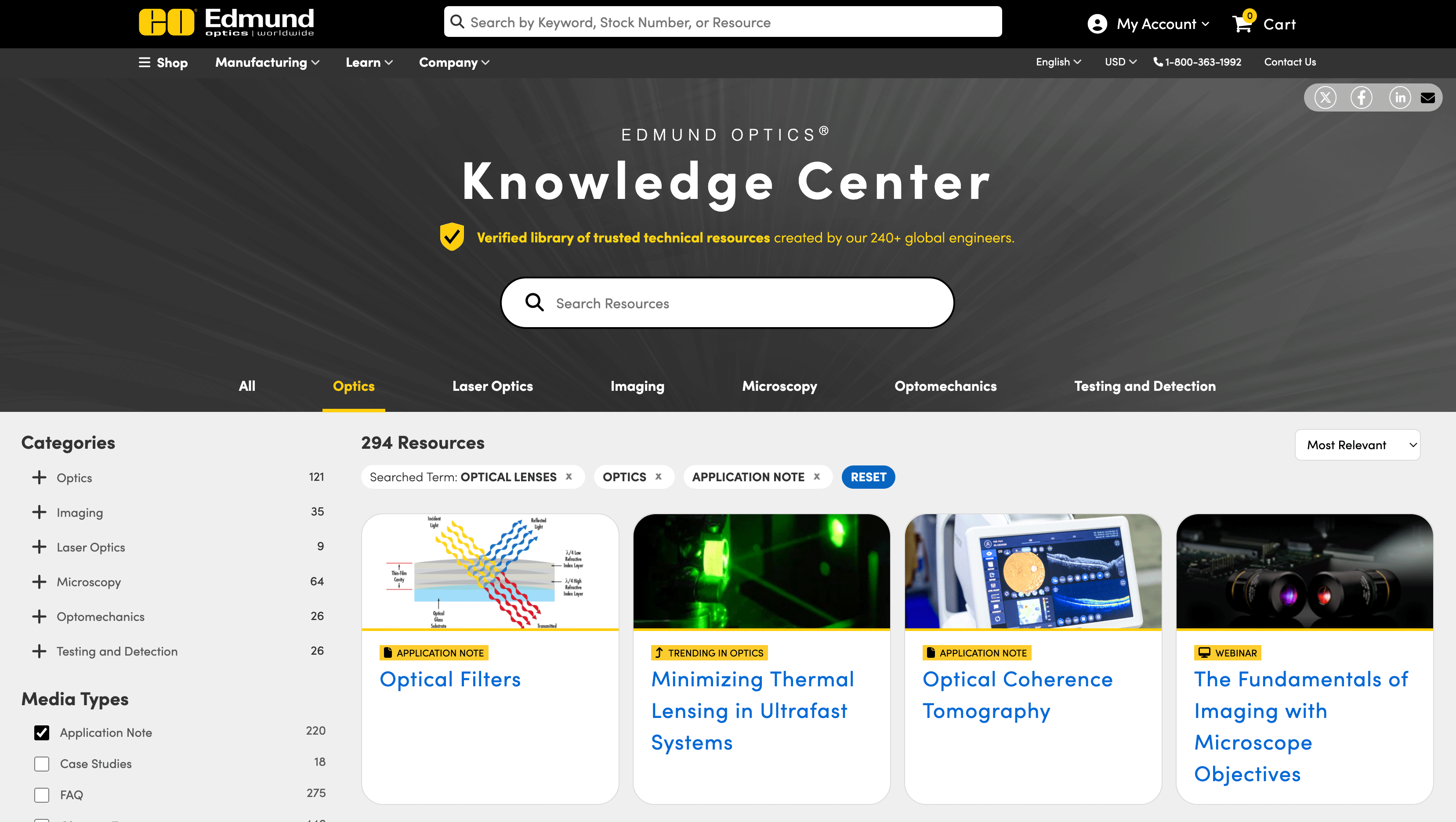
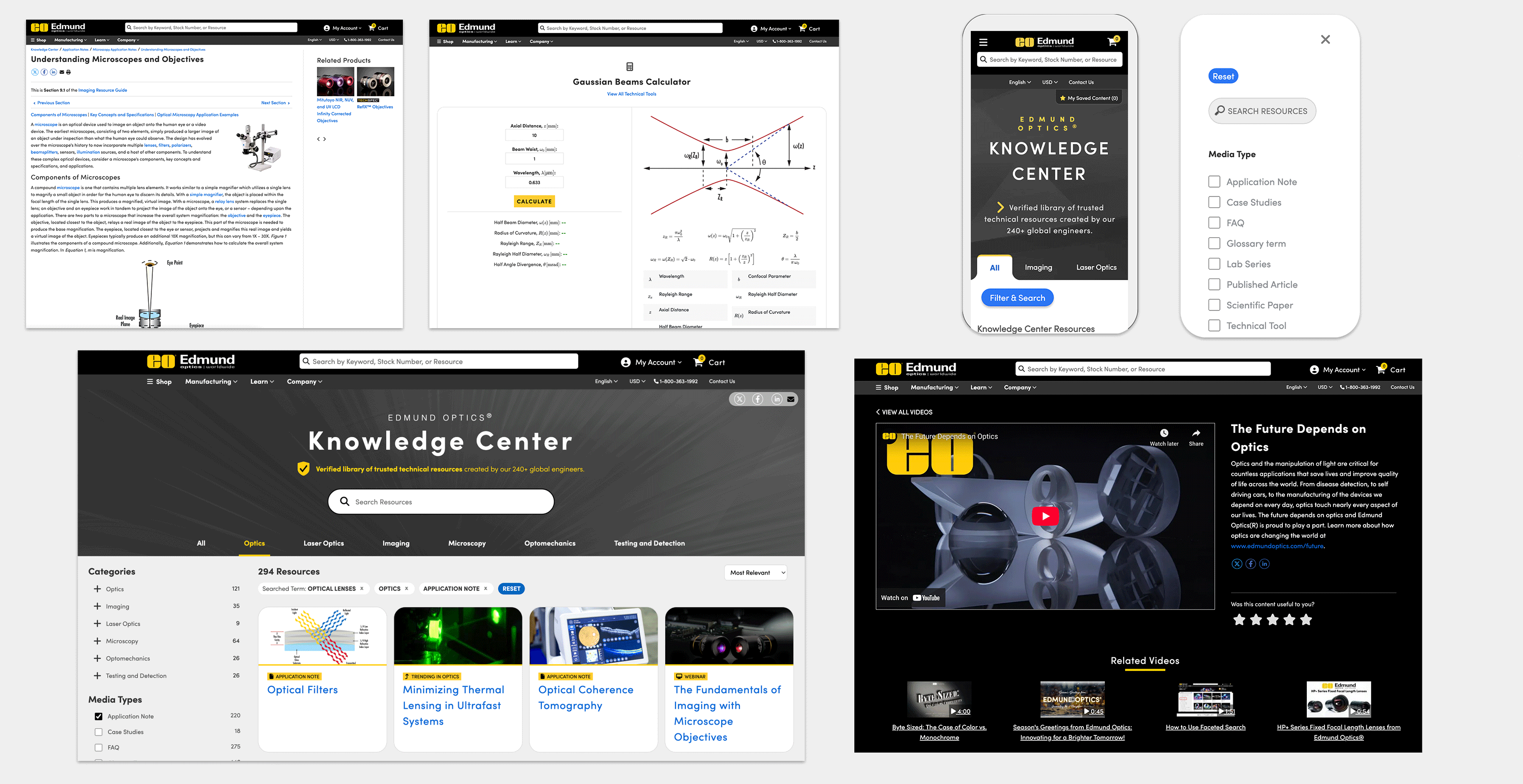
After gathering all the feedback, I began working on a mock-up, which went through several iterations and discussions with the committee. The final working mock-up, shown below, was coded in HTML, JavaScript/jQuery, and CSS.
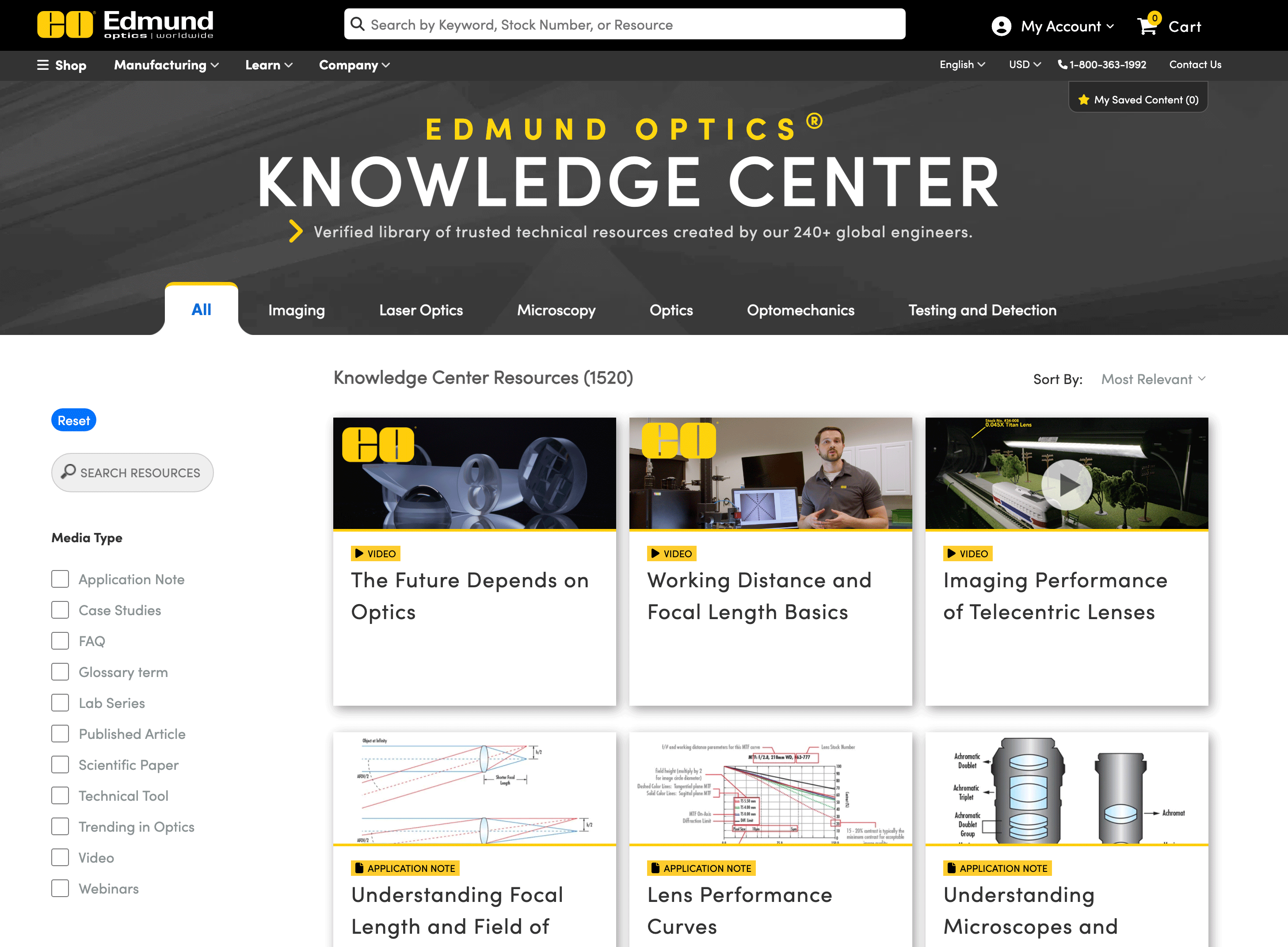
The personas revealed that a mobile-first experience was essential, as students and research customers primarily access content via mobile. This was in contrast to our B2B marketplace site, which is designed with a desktop-first approach.
Implementation and Iterations
After the webpage was built, it was handed over to the programming team to integrate with the database and ensure functionality. Once the technical setup was complete, the project was passed back to me for final clean-up and to ensure the design aligned with the original vision. The page then went through testing and quality assurance by various internal volunteers, identifying and fixing any bugs.
This version of the Knowledge Center was live for over a year when another round of analysis was proposed.
Our analysis team collected feedback and tracked customer usage to inform the next set of changes:
- The search box was too small and positioned in the corner.
- More space was needed to display additional tiles above the fold.
- Research indicated that the topic should be placed in the left navigation, as users were missing the tab design. A/B testing was conducted to compare both options.
Once the requirements were received, I began working on the next "working mock-up" and took the opportunity to refresh the design. After I completed the new design, I collaborated with our analysis team and a programmer to review it, and a few changes were proposed. The final design was then approved for implementation. See below for the updated version.